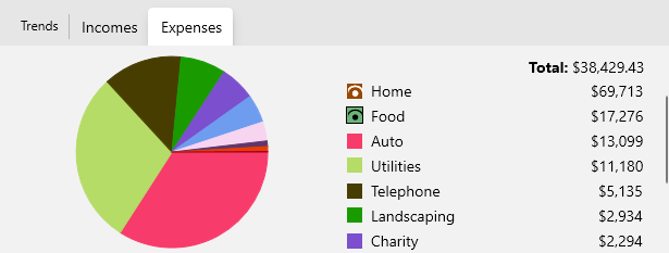
Pie Charts#
Accounts provide interactive pie charts of income and expense by category for the selected transactions you are looking at.
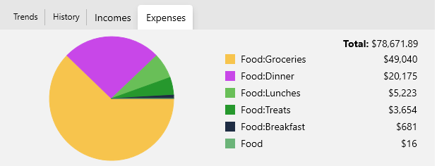
You can click on a pie slice to pivot to a new view showing all the transactions from the account associated with that category. For example if you click on "Food" you will see those transactions only and if you click on the "Expenses" tab again you will see the sub-categories broken out in the pie chart:
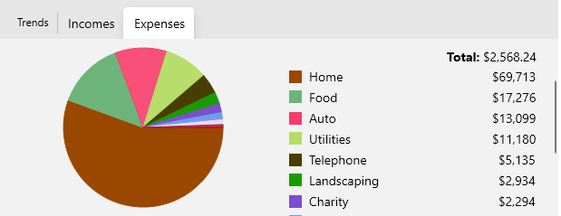
You can also click on the color swatch in the category legend to temporarily "hide" certain items from the chart so you can see more details more easily, for example, here we have hidden the "Food" and "Electronics" category. Simply click them again to bring those back into the chart. This is useful when you have one or 2 large categories that are dominating the chart.
Here we are hiding "Home" and "Food" from the pie chart so we can more easily see how the other categories compare: